
80% of our perception is based on visual contact. A customer who walks into your store forms a first impression before they even touch a product or speak to a salesperson. And that impression is decisive—it determines whether they stay, what they buy, and how much they spend.
Visual merchandising is a field that combines aesthetics, psychology, and business strategy into a single discipline: the presentation of products in a way that attracts, inspires, and motivates customers to make a purchase.
And the numbers confirm it: 70% of purchasing decisions are made right in the store (CAAD Design)—not at home before making a purchase, and not under the influence of advertising. Right here. In front of the shelves. That’s exactly why visual merchandising isn’t just about a pretty display—it’s a direct sales tool.
What is visual merchandising, and how does it differ from merchandising?
Visual merchandising —which includes storefronts, lighting, color schemes, racks, displays, in-store navigation, props, and digital screens—encompasses the entire visual aspect of the shopping experience.
How does it differ from merchandising? Merchandising is a broader concept—it encompasses in-store product management, restocking, planograms, and category management. Visual merchandising is the visual, aesthetic aspect of it: how a product looks and the impression it makes on the customer.
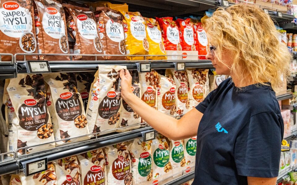
In practice, these two disciplines overlap: the merchandiser stocks the shelves, while the visual merchandiser determines how the entire shelf unit will look, which colors will dominate the campaign, and where the display for the new product line will be placed.
5 Basic Principles of Visual Merchandising
Effective visual merchandising is not based on chance or personal taste. It is based on proven principles that define how the human brain processes visual stimuli and responds to them.
1. Balance, Symmetry, and Focal Points
A customer will never say that your display is symmetrical—but subconsciously, they’ll linger in front of it a little longer.
The human brain seeks order and balance in space. Symmetrical layouts appear harmonious and professional—customers subconsciously perceive them as trustworthy. Asymmetrical layouts, on the other hand, create visual tension and interest—they work well for creative campaigns.
Focal points are places where the eye is naturally drawn—usually the center of the display, a lit product, or a striking color element. Properly placing the products you want to sell first in these focal points increases their sales without any further intervention.
2. Color Theory – Colors That Sell
You have less than two seconds before the color determines whether a customer stays or moves on.
Colors convey an emotional message before the customer reads a single word. And this message is quick—it takes less than two seconds.
- Red – urgency, excitement, impulse buying. Works well for sales, promotions, and limited-time offers.
- Blue – trust, reliability, expertise. It is the dominant color in banking, technology, and healthcare.
- Yellow and orange —energy, optimism, approachability. They attract attention and evoke a sense of friendliness.
- Green – nature, sustainability, health. It works in the organic/eco segments, pharmacies, and grocery stores.
The right color combinations in displays can increase sales by 35% (Colour Marketing Group, 2019). On the other hand, the wrong color scheme can deter customers before they even pick up the product.
3. Storytelling Through Displays
The best display isn’t the one that looks beautiful—it’s the one that makes the customer forget they’re shopping.
Customers don’t buy products—they buy an image of themselves. When a display tells a story— this is a trip to the mountains, this is a relaxing evening with the family, this is a morning when you feel great —the customer identifies with that story , and the likelihood of a purchase increases.
Storytelling in displays increases brand recall by 25% (HubSpot, 2021). It’s no coincidence, for example, that brands like Tefal set up entire kitchen scenes in stores—they’re selling an experience, not just a pot.
4. Lighting, Textures, and Props
Light conveys a sense of calm. A product that’s lit properly looks more valuable—and customers sense this, even if they can’t quite put their finger on it.
Lighting is one of the most powerful—yet most often underestimated—tools. Products look more valuable and appealing when bathed in bright light. The right interplay of light and shadow evokes emotions that customers respond to. Modern LED solutions allow not only for directional product lighting but also for dynamic changes in light color temperature based on the season or a specific campaign.
Textures and props help set the scene—wood evokes nature, metal suggests sophistication, and linen creates a warm, homey atmosphere. Props must be in line with the theme and value of the product: cheap-looking cardboard has no place alongside luxury jewelry.
5. Consistency with the brand identity
A customer forms a first impression only once. Every subsequent visit—whether at a different branch or during a different season—will either reinforce that trust or undermine it.
Visual merchandising that looks different in every store isn’t helpful—it’s harmful. A customer who is familiar with your store in one city should immediately recognize the same visual style in another.
Consistency builds brand recognition and trust. Customers know what to expect—and this predictability is the foundation of loyalty.
The Senses in the Store—What Customers Don’t See but Feel
Although “visual merchandising” starts with the word “visual,” modern product presentation engages all of the customer’s senses. This is an area where most stores still have enormous untapped potential.
Music
Music directly influences the pace at which customers move through a store. Studies have shown that sales can be up to 30% higher with slower-tempo music than with faster music (North, Hargreaves & McKendrick, Journal of Applied Psychology, 1999). Slower music slows customers down—and the longer they stay in the store, the more they’ll be drawn in and the more they’ll buy.
The choice of music genre also matters: when classical music is played in a restaurant, customers spend more than when pop music is playing. The reason? Classical music evokes a sense of luxury, and customers subconsciously choose more expensive dishes.
Scent
Scent marketing is one of the most powerful—and yet least utilized—tools. Scents are stored deeper in the brain than visual or auditory stimuli—they are directly linked to emotions and memory.
The number that says it all: In 84% of cases, customers choose a product in a store that has a scent— compared to a store without a scent (Sense of Smell Institute). Fragrances specially designed for specific types of stores (the scent of a bakery, the smell of freshly mowed grass in a garden center, and a clean, fresh scent in a drugstore) are now a standard part of premium retail strategies.
Planogram – the silent salesperson you don’t have to pay
A planogram is a graphical representation of the exact layout of products on the sales floor. It specifies where each SKU is located, at what height, in what quantity, and next to what.
Products placed at the customer’s eye level are 82% more likely to be purchased than the same products on lower shelves (Retail TouchPoints, 2017). That’s why the most sought-after shelf locations come at a premium—and why optimizing the planogram is one of the most profitable activities in retail.
In the retail world, there’s a tried-and-true rule: well-displayed merchandise sells itself—it’s a silent salesperson you don’t have to pay.
From hypermarkets to pharmacies: what works differently in each segment
Each sales segment has a different customer base, a different purchasing situation, and different priorities when it comes to visual presentation.
Hypermarkets and Supermarkets: The Battle for Every Centimeter of the Customer’s Attention
Large-scale retail stores, hundreds of meters of aisles, thousands of products competing for attention. The critical areas here are the end-caps (ends of the aisles), the entrance zone, and the checkout line —the areas with the highest foot traffic and the greatest potential for impulse purchases.
Customers notice products at the end of an aisle 60% more often than those in the middle of a shelf (NRF, 2016). That is why end-cap positions are so valuable and why brands actively compete for them.
Specialty Store: When the Customer Has Time and the Details Make All the Difference
A smaller space, but a much more specialized customer base. These customers know what they want—but they may be surprised by well-executed cross-merchandising (complementary products displayed side by side) or an attractive themed display that catches their eye as they leave.
Pharmacy and Drugstore: Where Clarity Sells More Than Creativity
Customers at a pharmacy are more discerning and cautious. Visual merchandising here focuses on clarity, expertise, and trustworthiness —not on impulse buying. Clear categorization, a clean space, and informative signs are more important than creative displays.
HORECA: Where Visuals Are Not Just an Accessory, but an Integral Part of the Experience Itself
In the restaurant industry, visual merchandising includes the design of tables, plates, menus, and bar displays. Customers perceive the overall experience—and it is precisely this visual harmony that determines whether they will return.
Five Mistakes That Quietly Sabotage Sales—and Most Stores Make Them
Even minor visual flaws can cause a customer to leave without making a purchase—and not know why.
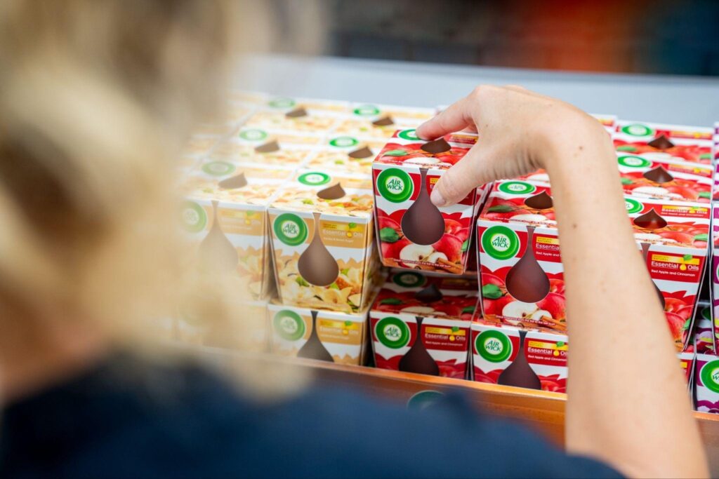
1. Overcrowded Displays: When there are too many products, customers get lost and can’t find what they’re looking for. A minimalist presentation increases the perceived value of a product by 28% (Fast Company, 2017). Less is more.
2. Poor Lighting A dark shelf is an invisible shelf. Products in dim light appear less valuable, and customers will skip over them. Lighting isn’t just about aesthetics—it’s a direct sales driver.
3. Ignoring Seasonality A customer who still sees Christmas decorations in January loses confidence that the store is up-to-date and relevant.
4. Inconsistent presentation across stores. When a customer visits a different store in your chain and finds that the products are arranged completely differently, it undermines trust in the brand. A consistent planogram and visual identity are essential.
5. Poor or Missing Signage A customer who doesn’t know where things are will leave frustrated. Clear, legible, and well-placed directional and informational signs are a basic requirement for any store.
Sell-through, dwell time, and compliance: How do you know it’s working?
Visual merchandising without measurement is just an artistic performance. To know what works and what doesn’t, you need data.
The sell-through rate indicates how quickly products on a specific shelf or display are sold out. If the sell-through rate has increased following a planogram change, visual merchandising is working.
Dwell time (time spent in front of a display) measures how much time customers spend looking at a specific display. Longer dwell time = greater interest = a higher chance of a purchase.
In-store conversion rate – the percentage of customers who entered the store and actually made a purchase. This figure is a direct reflection of how well visual merchandising is working.
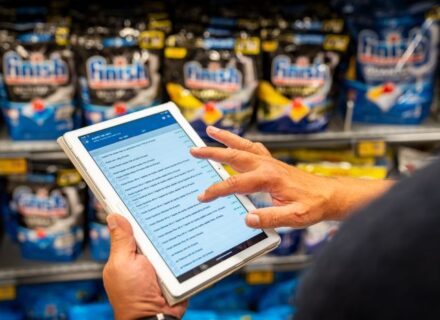
Photo reporting and planogram compliance – regular photographic documentation of the store’s condition (ideally by merchandisers in the field) and comparison with the required planogram will reveal discrepancies before they affect sales.
Mystery shopping is also a powerful tool here—an external evaluator can assess both the store’s visual appearance and customer service. You can find out more about how mystery shopping helps measure the customer experience in our article.
A 300% ROI and a 20% increase in time spent in-store: these are measurable results
A customer who enters a visually appealing store spends 20% more time there (NRF, 2020). And the more time they spend, the more they buy—both intentionally and on impulse.
Investing in experienced visual merchandisers and professional product displays yields an ROI of up to 300% (Retail TouchPoints, 2015). This is no coincidence—it is the result of a systematic approach to what customers see, feel, and experience.
If you’re looking for a partner who can ensure the professional presentation of your products in hundreds of stores—from restocking to adhering to planograms to reporting— check out our merchandising services or contact us for a no-obligation consultation.